Learn how to add a chart to your spreadsheet.
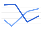 Line
Line
 Line
LineUse a line chart to look at trends or data over a time period. Learn more about line charts.
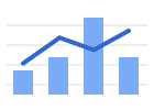 Combo
Combo
 Combo
ComboUse a combo chart to show each data series as a different marker type, like a column, line, or area line. Learn more about combo charts.
 Area
Area
 Area
AreaUse an area chart to track one or more data series graphically, like changes in value between categories of data. Learn more about area charts.
Related charts: Stacked area chart, 100% stacked area chart, Stepped area chart, Stacked stepped area chart, 100% stacked stepped area chart
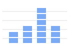
 Column
 Column
Use a column chart to show one or more categories, or groups, of data, especially if each category has subcategories. Learn more about column charts.
Related charts: Stacked column chart, 100% stacked column chart
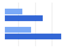 Bar
Bar
 Bar
BarUse a bar chart to show the difference between the data points for one or more categories. Learn more about bar charts.
Related charts: Stacked bar chart, 100% stacked bar chart
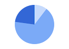 Pie
Pie
 Pie
PieUse a pie chart, also known as a pie graph, to show data as "slices of pie," or proportions of a whole. Learn more about pie charts.
Related chart: Doughnut chart
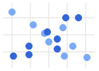 Scatter
 Scatter
Use a scatter chart to show numeric coordinates along the horizontal (X) and vertical (Y) axes and to look for trends and patterns between two variables. Learn more about scatter charts.
Related charts: Bubble chart
 Histogram
 Histogram
Use a histogram chart to show the distribution of a data set across different buckets. Learn more about histogram charts.
 Candlestick
 Candlestick
Use a candlestick chart to show an opening and closing value overlaid on a total variance, like changes in stock value. Learn more about candlestick charts.
 Organizational
 Organizational
Use an organizational chart, also called an org chart, to show the relationship between members of a company, group of people, or family tree. Learn more about organizational charts.
 Tree map
 Tree map
Use a tree map to show a data tree, where objects are organized into parent-child hierarchies. Learn more about tree map charts.
Geo
Use a geo chart to show a map of a country, continent, or region. The values for each location will be shown with colors. Learn more about geo charts.
Waterfall
Use a waterfall chart to show how later values add or subtract from a starting value. Learn more about waterfall charts.
Radar
Use a radar chart to show one or more variables in a two-dimensional graph, with one spoke for each variable. Learn more about radar charts.
Gauges
Use gauges to show numeric values or measurements within a range. Each value produces a gauge, so you can compare and contrast measurements. Learn more about gauge charts.
Annotated timeline
Use an annotated timeline to show an interactive time series line chart with the option to add notes. Learn more about timeline charts.
Table
Use a table chart to turn your spreadsheet table into a chart that can be sorted and paged. Table charts are often used to create a dashboard in Google Sheets or embed a chart in a website. Learn more about table charts.